
Less is More in Outdoor: The Design Rule for Ads that Actually Stand Out
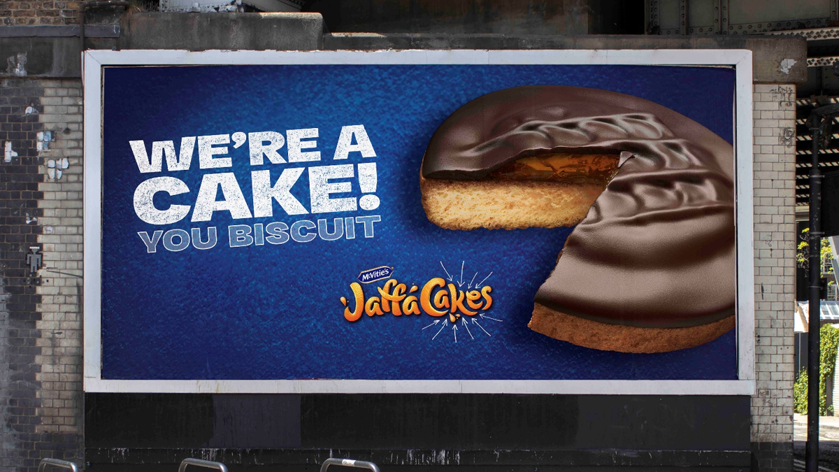
For outdoor and DOOH, visuals are everything. One image. A fleeting chance to capture attention. Just 2 seconds to land brand recognition, emotion, impact.
Lots of brands doing it wrong.
In outdoor advertising, it’s easy for brands to assume that the louder they shout, the more attention they’ll get. In reality, adding more messaging, product shots or visual stimuli won’t actually drive more attention, and instead, brands risk overcrowding their poster or billboard with a jumble of visuals that don’t make sense together. Instead of standing out, their branding blends into chaos and cognitive overload.
So how can brands use tried and tested techniques to sharpen up their visuals and draw attention to their branding? System1’s expert consultants team dug into our Test Your Ad database to find out.
Enter The 60/30/10 Rule.
The 60/30/10 rule is a well-established guideline in interior and web design to create visually appealing colour schemes, by using a combination of 3 colours in a specific way.
60% of the design should be a dominant colour; the main colour covering most of the space.
30% of the design should be a secondary colour; one that complements the dominant colour and frames the colour palette.
The last 10% should be an accent colour; a contrasting colour that gets used sparingly to add interest.
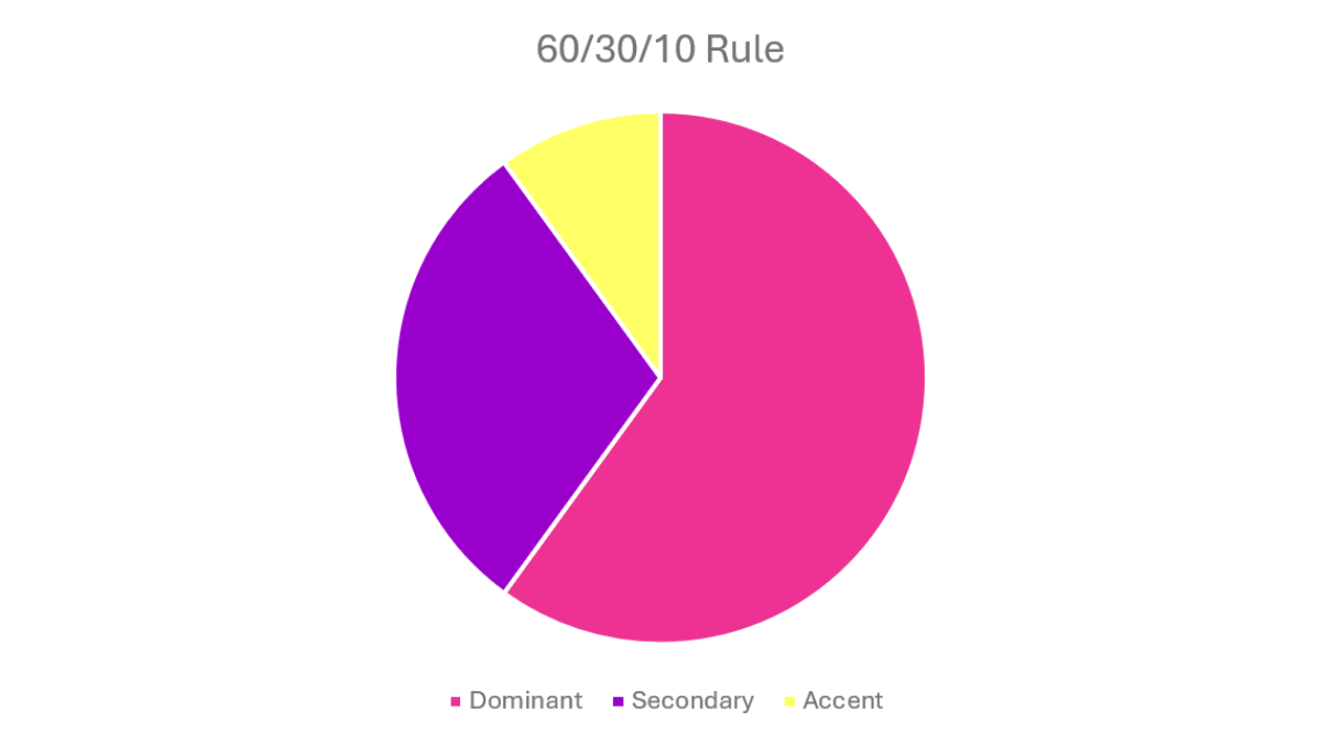
The great thing about this rule is the use of the accent colour. Keeping contrasting colours to only 10% of the design means they can be utilised to draw the eye to certain details, which allows specific elements of branding and messaging to be highlighted without being outshone.
And we’ve got the data to prove it!
Outdoor Brand Recognition: Street Smart Colours.
This is already a well-known rule of aesthetics for interior and web designers, but creatives can apply the same principles to outdoor advertising, to ensure the eye is drawn to the right places. If an outdoor ad uses an accent colour to highlight brand colours, logos, distinctive assets or product, this will enable quicker brand recognition, as the viewer is naturally drawn to looking at those details.
Jaffa Cakes’ Sweet Approach to Colour.
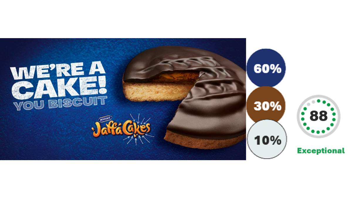
Take this ad from Jaffa Cakes and TBWA\London by example. The white accent colour immediately draws the eye to the brand name, and the secondary colour also stands out easily against the blue background. All three colours signal to Jaffa Cakes’ branding, and the distinctive assets are easily recognisable. This is reflected in the ad’s exceptional Fast Fluency score of 88%, which is 28% higher than the average Fast Fluency on System1’s database of UK outdoor.
Fast Fluency is System1’s measure of how quickly an audience can identify which brand the ad they are viewing is for. Fast Fluency mimics real life viewing scenario’s giving respondents just 2 seconds to name the brand, simulating the 2 second viewing window a passerby may have with outdoor ads in real life. So, if the visuals purposefully draw attention to branding, the viewer should be more likely to identify the brand, quickly. With such a short window, brands can’t afford to leave recognition to chance, which is exactly why techniques like the 60/30/10 rule are so valuable.
Contrast Carries.
However, not all brands have the luxury of a distinctive colour palette like Jaffa Cakes, but that’s no reason to miss out. Colours can still lean into high contrast pairings to allow other distinctive assets such as character, typeface or even pack shapes to pop.
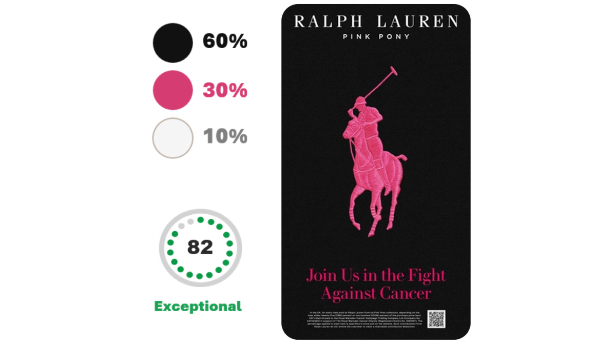
For example, Ralph Lauren turned its iconic pony logo pink for a Cancer awareness campaign. This doesn’t relate to the usual colours of the brand, but the use of a bold black background immediately pulls the eye to the recognisable logo. With an exceptional Fast Fluency score of 82, Ralph Lauren proves that even without a signature palette, the colour contrast can still make branding land.
Heinz’s Saucy Colour Palette.
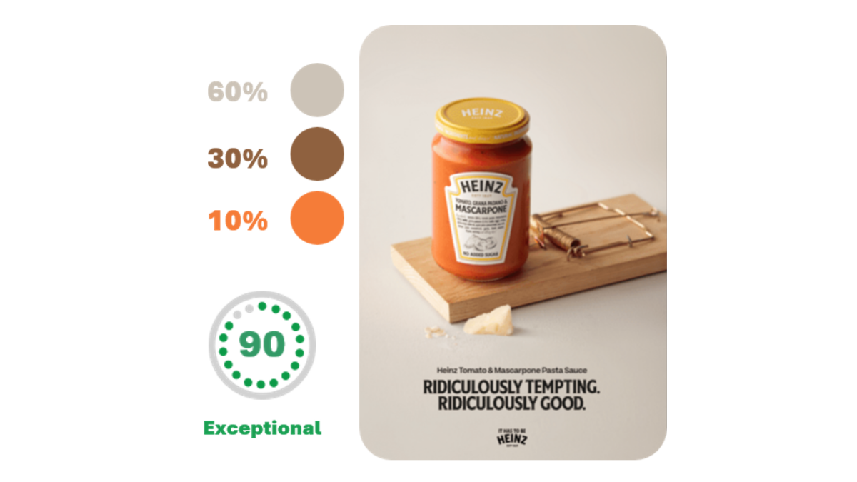
Similarly, Heinz use a limited but intentional colour palette in this outdoor ad, which resulted in an exceptional fast fluency score of 90%. The recognisable Heinz logo and product itself are being made to stand out here, ensuring that viewers don’t miss the branding in this ad.
The accent colour draws the viewer first to the Heinz label and then lets them take in the context within the ad: that Heinz is so good, it can be used to bait people into a mouse trap, just as the colours have baited our attention here.
The Verdict: Three’s A Crowd-Pleaser.
The 60/30/10 rule makes sense in advertising because, when visuals create a sense of balance, the eye can move comfortably from one focal point to the next.
Jaffa Cakes, Heinz, and Ralph Lauren prove the point: a disciplined palette and a well-placed accent colour send Fast Fluency soaring. It makes it easier for viewers to take in the key message being conveyed, and it’s an opportunity to match the colour palette of the brand with the colour palette of the ad.
Importantly, the 60/30/10 rule is not just about using three colours but using them strategically. If you aren’t using these colour proportions to highlight your branding or key message, you’re missing out on vital Fast Fluency points, as viewers see the ad but miss the message.
Create with Confidence®
At System1, we help brands maximise real-world commercial impact at every stage of the creative process. Our expert consultants team can help you refine and sharpen any ad, idea or concept at any stage of the development process, even down to details such as colour ration. And with metrics to mimic real life behaviour and viewing scenarios, Test Your Ad allows you to benchmark exactly how quickly your brand springs to mind, so your next outdoor ad can stand out where it counts.