
The Bland vs Brand Tension in Outdoor Creativity
The tension between emotion and distinctiveness has never felt more apparent than at Cannes Lions. Across the Palais stages, on the shortlist, and among the winners, we see the same creative trade-off emerge: bold, arresting outdoor work that turns heads, but too often leaves the brand behind. It’s a challenge that extends far beyond awards season. Every day, marketers wrestle with the belief that creating emotionally powerful outdoor advertising means dialling down logos, brand assets and other distinctive cues.
But is that really a trade-off worth making? Does branding dilute creativity, or could it be the very thing that stops great ideas becoming forgettable? Can emotion and distinctiveness work together, rather than compete?
To find out, we looked at the 2026 Cannes Lions outdoor winners through the lens of Double Take, our collaborative research with JCDecaux. Drawing on more than 1,000 campaigns tested with 180,000 people across seven markets, the report uncovers the principles that make outdoor advertising both creatively celebrated and commercially effective.
But First, the Stats
We tested every shortlisted and winning Outdoor and Print campaign from Cannes Lions 2026 to see which creatives successfully balanced emotion with distinctiveness. The overall picture suggests the tension is real. On average, campaigns earned just 2.0 Stars for emotional response and 63% Fluency, meaning over a third of people couldn’t correctly identify the brand.
In other words, many campaigns succeeded in grabbing attention but struggled to leave a memorable brand impression.
There were notable exceptions. Winners such as IKEA and KitKat, alongside shortlisted work from Cornetto, proved that emotional, visually striking creativity doesn’t have to come at the expense of branding. They show that the strongest outdoor advertising isn’t just bold. It’s unmistakably branded too.
Why It Works: IKEA & Mother “Brighton Store Launch”
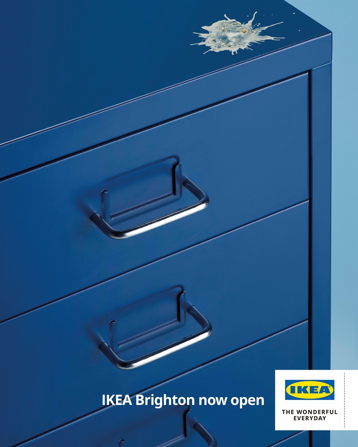
One of my favourite campaigns from Cannes Lions, IKEA’s Brighton Store Launch proves that simple doesn’t have to mean forgettable. By tapping into Brighton’s infamous seagulls, it feels locally relevant while staying unmistakably IKEA through its minimalist design, iconic typography and bold branding.
The campaign outperformed the Outdoor winners on emotion, but its real strength was distinctiveness, achieving 92–97% Fluency, the highest in the category.
The principles from Double Take explain why. Each execution uses fewer than seven words, a choice linked to an 11 percentage point uplift in two-second brand recall. It also communicates a single, clear message: the Brighton store is open. With only a couple of seconds to capture attention, simplicity reduces cognitive overload and makes the brand easier to remember.
The lesson is clear: in outdoor, less isn’t less. A few strong, prominent brand assets will work harder than trying to say everything at once.
Why It Works: KitKat & VML “Little Breaks”
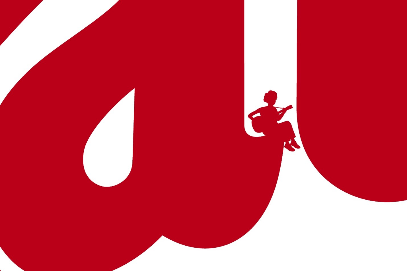
Like IKEA, KitKat proves that simplicity works hard in outdoor. But instead of letting the product dominate, it puts the logo centre stage. Our Double Take research found that logos occupying at least 10% of the creative increase viewing time by 29% and make brands 2.7x more likely to be recognised within two seconds. KitKat puts this principle into practice, achieving 93% Fluency.
It also struck the strongest balance between branding and emotion across the Cannes Lions winners, earning 3.5 Stars. The miniature figures relaxing on the KitKat logo create a rewarding visual twist that brings the brand’s famous “Have a Break” positioning to life. It’s distinctive, emotionally engaging and designed to reward repeated viewing. The kind of clever simplicity that makes great outdoor memorable.
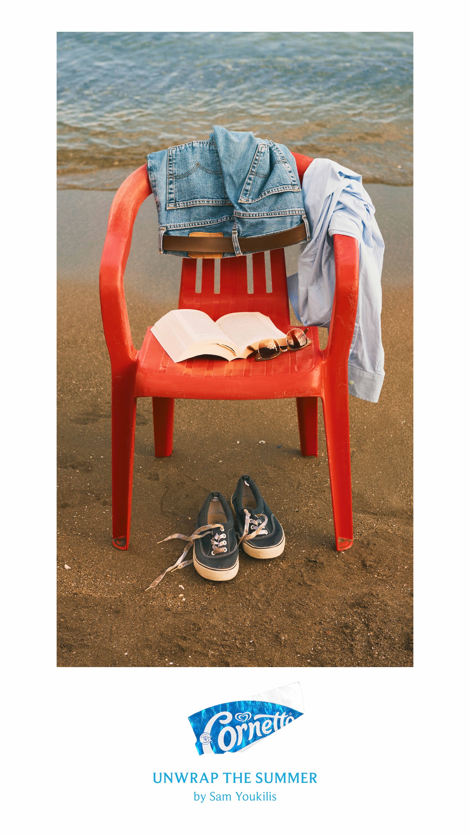
Why It Works: Cornetto & Lola “Unwrap the Summer”
Cornetto has long mastered playful outdoor advertising, often using its packaging and logo as part of the creative idea. Unwrap the Summer shows why that matters.
We tested all five executions, but only one, the Red Chair, achieved above 3 Stars and above-average Fluency. The key difference wasn’t the context or colours. It was the branding. It’s the only execution that shows the Cornetto logo in full.
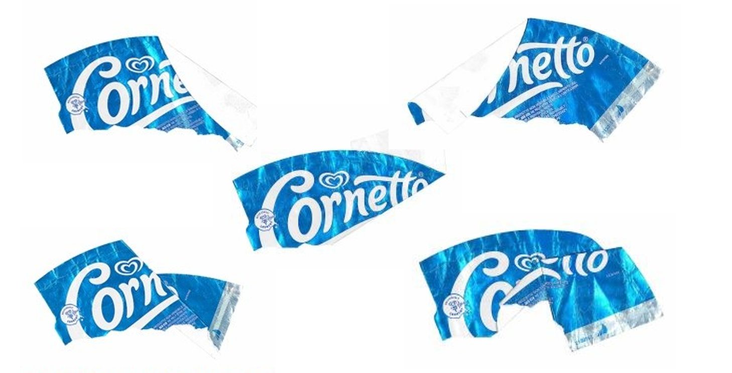
The other executions partially obscure the logo, making the visual metaphor harder to decode. Without that clear brand cue, the images became more ambiguous. Many Spanish consumers even interpreted them as litter left behind by tourists, rather than joyful reminders of a day at the beach. By contrast, the Red Chair execution immediately connected people to Cornetto and the positive emotions of summer, showing how branding doesn’t just improve recall, it shapes how people interpret the creative itself.
It also demonstrates the value of creative testing. The campaign was rightly shortlisted at Cannes and celebrated across the industry, but testing revealed that not every execution landed equally well with consumers. A simple optimisation, showing the full logo consistently across every asset, could have strengthened both emotional response and brand recognition. It’s exactly the kind of insight that creative testing uncovers before a campaign goes live, helping great ideas become even more effective.
Create with Confidence®
Outdoor is one of advertising’s most powerful growth channels, with 57% of its returns driven by long-term brand building. Yet too many campaigns are seen but not remembered. System1’s testing shows that 40% of outdoor advertising fails to generate an emotional response, while one in three exposures results in no brand recognition.
As this year’s Cannes Lions work demonstrates, the balance between emotion and distinctiveness isn’t a matter of opinion. It’s measurable.
With Test Your Ad Outdoor, System1 helps brands understand whether their creative is both emotionally engaging and unmistakably branded before it goes live, so you can maximise commercial impact, not just creative acclaim.
Ready to create with confidence?